
Hack: The Classic Code Font That Still Feels Fresh
Some programming fonts make their case by doing something conspicuous: dramatic cursive italics, dense ligatures, a variable axis for every impulse, or terminal icons by the thousand. Hack is compelling for the opposite reason. It is a practical code face that looks as though it has already survived a decade of real work.
That is why it remains one of my favourites. Hack has a classical skeleton, but it does not feel antique. Its forms are calm, sturdy, and carefully resolved; its punctuation has enough presence to keep code from dissolving into grey texture. It is not trying to turn source code into calligraphy. It is trying to make a working day of reading and editing source code feel less effortful.
For a first entry in this series, that makes Hack a fine benchmark. It represents an important strand of programming typography: open-source, screen-first, legibility-led, and satisfied to be a dependable static family.
At a Glance
| Property | Details |
|---|---|
| Designer / project | Source Foundry, with contributions from the wider open-source type community |
| Lineage | Bitstream Vera Sans Mono and DejaVu |
| Latest upstream release reviewed | v3.003, the latest release listed by the project as checked on September 3, 2026 |
| License | MIT for Hack; upstream Bitstream Vera components retain their own license terms |
| Styles | Regular, Bold, Italic, and Bold Italic |
| Glyph coverage | More than 1,500 glyphs, including extended Latin, modern Greek, and Cyrillic |
| Coding ligatures | No; operator characters remain separate glyphs |
| Powerline | Included in the regular face |
| Formats | Desktop TrueType plus WOFF and WOFF2 web fonts |
| Best fit | Small-to-medium editor text, conventional code, terminal-heavy work, and readers who prefer literal operators |
Why Hack Exists
Hack describes itself plainly as “a typeface designed for source code.” The phrase understates the amount of design judgement hiding behind it. The project takes the familiar, highly practical lineage of Bitstream Vera Sans Mono and DejaVu and reworks it specifically for the harsh conditions of on-screen source code: small text, dense punctuation, syntax colour, low-resolution rendering histories, and long reading sessions.
The lineage is visible. Hack does not discard the compact, humanist character that made Vera and DejaVu useful. Instead, it narrows the question to what programmers repeatedly need to distinguish while scanning: a zero from a capital O, a lowercase l from a one, a comma from a period, and punctuation from the letters around it.
This is a different temperament from a font designed around a brand system or a fashionable visual signature. Hack is designed as a tool. Its personality comes from the discipline of that toolmaking.
The Design Language: Classical Bones, Screen-First Finish
Hack’s appeal begins with proportion. The lowercase is relatively tall, with a large x-height that makes text look substantial without requiring a large point size. The project identifies the 8 to 14 point range as its sweet spot, which is exactly where a coding font earns its keep. At that size, a delicate design can fade; Hack stays present.
The counters are open and the apertures generous. This matters more than it sounds. In a dense block of code, the space inside and around a glyph is part of the signal. Open forms keep letters from collapsing into one another when anti-aliasing is imperfect, when a display is scaled, or when an editor is rendering a lot of coloured punctuation at once.
Hack keeps stroke contrast low and terminals sturdy. The result is neither geometric nor ornamental. Round forms have a quietly squared-off quality; stroke endings and extenders have enough angle to add energy without making the page twitchy. It has the slightly engineered flavour of a good late-twentieth-century technical face, cleaned up for contemporary screens.
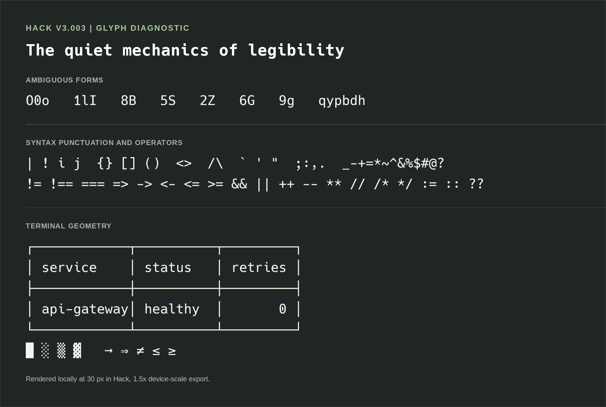
Local Hack v3.003 glyph diagnostic, rendered at 30 px and exported at 1.5x device scale.
The Details That Make It Feel Deliberate
Three decisions explain much of Hack’s day-to-day polish:
- A filled zero counter. The zero receives an oval fill rather than a slash or dot. It remains unmistakable beside
O, but the solution belongs to the rest of the typeface instead of looking pasted on. - Strategic serifs. Small serifs appear where narrow forms need help holding their place in a monospaced rhythm. They improve the distinction between
l,1, andIand avoid the empty side-space that can make narrow characters look lost. - Assertive punctuation. In the regular style, punctuation is deliberately closer to semi-bold in weight and receives generous sidebearings next to alphabetic characters. Braces, commas, quotes, operators, and delimiters do not vanish when code gets busy.
These are not headline features in the way ligatures are, but they are the sort of decisions that compound over a long editing session. Hack makes syntax look structured because its non-letter characters are treated as first-class citizens.
What to Inspect Closely
Before deciding that any programming font is “clear,” inspect the characters that carry the most ambiguity. Hack is particularly good at turning this inspection into a positive experience.
O0o  1lI  | ! i j  {}[]()  <>  /\\  ` ' "  ;:,.  _-+=*~^&%$#@?
Il1  O0  8B  5S  2Z  6G  9g  qypbdh
The forms are distinct without being theatrically distinct. 0 is visibly not O; 1 and lowercase l do not ask the reader to infer identity from surrounding context; g, q, p, b, and d maintain individual silhouettes. The difference between comma and period is especially valuable at small sizes, where sloppy punctuation can become a genuine reading tax.
The punctuation spacing is equally worth examining in real code. Hack gives operators and delimiters a little air. That can make dense expressions easier to parse, but it also means that someone seeking the tightest possible information density may prefer a narrower, more compressed family such as Iosevka.
No Ligatures Is a Position, Not an Omission
Hack does not ship programming ligatures. !=, =>, ===, and -> remain sequences of their constituent characters.
For some readers, this will immediately rule it out. If you find ligatures reduce visual noise and help operators read as units, Fira Code, JetBrains Mono, or Cascadia Code are sensible alternatives. But Hack’s choice has a coherent upside: every character you see is exactly the character the file contains, with no additional typographic interpretation.
That literalness is useful in code review, pair programming, teaching, debugging text protocols, and any situation where you want punctuation to retain its individual visual identity. It also makes Hack pleasantly portable: there is no editor-specific ligature setting to remember, no partial OpenType support to troubleshoot, and no concern that an unfamiliar terminal will render an operator differently.
type Result<T> = { ok: true; value: T } | { ok: false; error: Error };

function parsePort(value: string): Result<number> {
  const port = Number.parseInt(value, 10);
  return Number.isInteger(port) && port >= 0 && port <= 65535
    ? { ok: true, value: port }
    : { ok: false, error: new Error(`Invalid port: ${value}`) };
}
In Hack, the type union, equality tests, arrows, template interpolation, and braces all remain visibly separate. Whether that is better is personal; whether it is predictable is not.
Four Faces, Used Well
Hack is a static family with four core faces: Regular, Bold, Italic, and Bold Italic. That looks modest beside newer variable superfamilies, but it covers the roles most syntax themes actually need.
The bold is firm enough to establish hierarchy without turning keywords into dark blocks. The italic is restrained. It adds a clear slant and enough distinction for comments, types, or emphasised documentation, but it does not seize attention from the code around it. The family feels coherent because the styles have the same basic rhythm.
The limitation is equally straightforward: there are no width, optical-size, weight, or slant axes to tune. If your workflow depends on a very light display style, a semibold editor weight, a compact width, or a tailored grade, Hack will not give you those controls. Its value is consistency, not customisation.
Unicode, Box Drawing, and the Terminal
Hack’s support for extended Latin, modern Greek, and Cyrillic makes it more useful than an ASCII-only coding face. Its broad glyph repertoire is particularly welcome for identifiers, documentation, command output, and source files that include more than English.
The regular face also includes Powerline glyphs, so a Powerline-style prompt can work without a separate patch. That is a practical distinction: a Nerd Font build is a modified distribution that injects a much larger icon set, whereas Hack’s included Powerline support is part of the font’s own feature set.
For terminal work, verify the actual environment rather than trusting a feature list. Terminals differ in shaping, fallback selection, emoji width, and box-drawing behaviour. Run your preferred prompt, a table, and your language toolchain after installation. The test below catches many of the alignment mistakes that an editor specimen cannot reveal.
┌────────────┬──────────┬─────────┐
│ service    │ status   │ retries │
├────────────┼──────────┼─────────┤
│ api-gateway│ healthy  │       0 │
│ billing    │ degraded │       2 │
└────────────┴──────────┴─────────┘

branch: main  ->  build: passed  !=  deploy: pending
Hack is a strong terminal candidate because it is conservative where terminals are conservative. Still, Powerline support is not a guarantee that every modern icon prompt will align: Nerd Font icons, emoji, and glyphs supplied by fallbacks need their own check.
Installing and Using Hack
The official project distributes TrueType desktop builds, web fonts, and a Windows installer. The latest upstream release listed by the project is v3.003; record that exact version in any comparison screenshots because font rendering is part of the result.
Linux
The project documents direct installation into a user font directory followed by a font-cache refresh:
mkdir -p ~/.local/share/fonts
# Extract the official Hack archive into ~/.local/share/fonts/Hack first.
fc-cache -f -v
fc-list | grep "Hack"
Hack is also available through several distribution package managers, including Debian and Ubuntu’s fonts-hack-ttf and Arch’s ttf-hack. A distribution package may trail the upstream release, so confirm the installed version if that matters to the article or a team setup.
macOS and Windows
On macOS, install the .ttf files from the official archive through Font Book. On Windows, the project recommends the Hack Windows Installer, which is intended to handle common update and rendering issues. In either case, fully quit and reopen the editor or terminal after installing a font; many applications only enumerate installed fonts at launch.
Web Use
Hack ships WOFF and WOFF2 web-font builds and can be self-hosted. For a quick prototype, the project’s documented jsDelivr stylesheet is:
<link
  rel="stylesheet"
  href="https://cdn.jsdelivr.net/npm/hack-font@3.3.0/build/web/hack.css"
/>
Then apply it deliberately to code surfaces rather than globally:
pre,
code {
  font-family: "Hack", monospace;
}
For a production site, self-host the required subsets and weights where possible. It avoids an extra third-party request and lets you control the exact version your screenshots and CSS expect.
A Short Working Specimen
Hack has enough presence to make a compact algorithm readable without making it feel decorated. The wide punctuation and strong lowercase give this example a balanced, workmanlike texture.
from collections.abc import Iterable


def compact_ranges(values: Iterable[int]) -> list[tuple[int, int]]:
    ordered = sorted(set(values))
    if not ordered:
        return []

    ranges: list[tuple[int, int]] = []
    start = end = ordered[0]
    for value in ordered[1:]:
        if value == end + 1:
            end = value
            continue
        ranges.append((start, end))
        start = end = value

    ranges.append((start, end))
    return ranges
The point is not that Hack makes an algorithm simpler. It makes the structural landmarks easy to pick out: : ends a control statement, [] signals indexing or a type, () groups a result, and the indentation retains visual firmness. Nothing is showy, so the syntax can do its job.
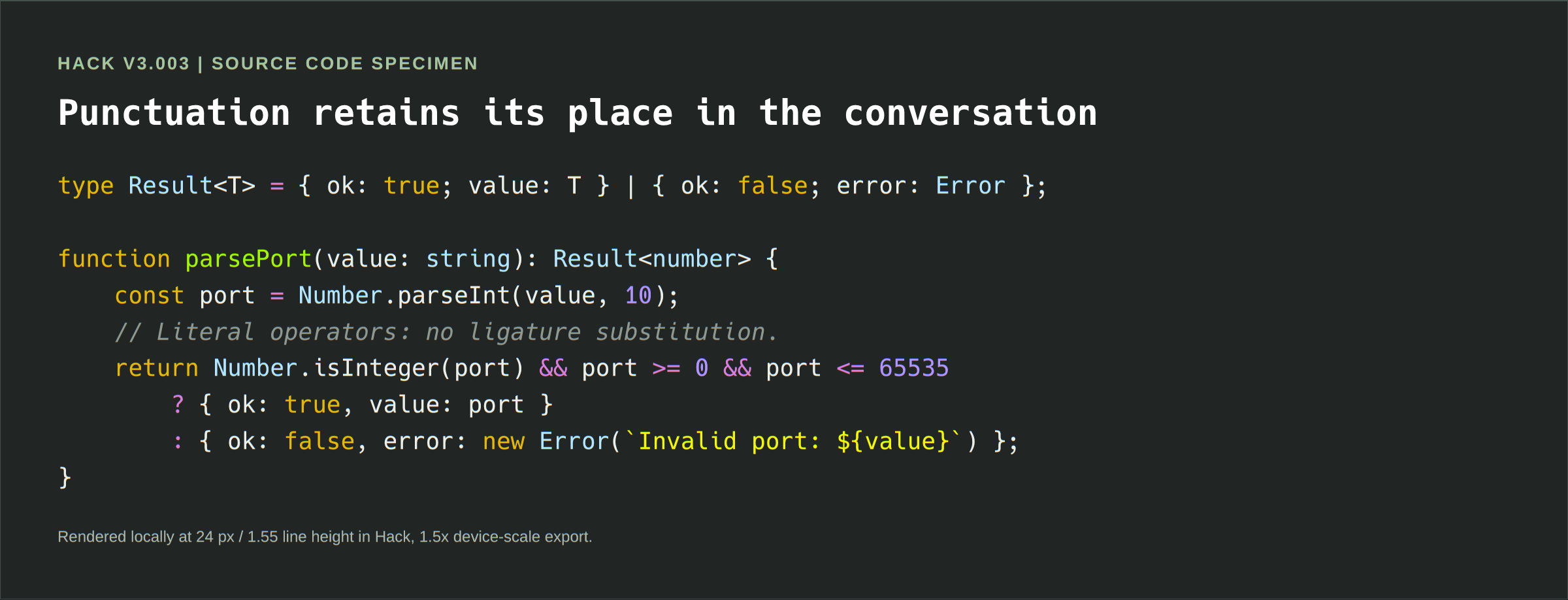
Local Hack v3.003 TypeScript specimen, rendered at 24 px with 1.55 line height and exported at 1.5x device scale.
Where Hack Excels
- Editors at everyday sizes. The large x-height, open forms, and firm punctuation earn their value at the
8to14point range where people actually code. - Conventional, punctuation-rich languages. C, Java, JavaScript, TypeScript, Python, Go, Rust, and shell scripts all benefit from clear delimiters and operator characters.
- Terminal-first workflows. Built-in Powerline glyphs and a pragmatic static design suit terminals, multiplexers, and remote environments.
- Teams that value predictable rendering. No coding ligatures and only four standard faces means fewer differences between editors and platforms.
- Open-source and self-hosted work. The MIT license and available web builds make Hack an unusually straightforward choice for products, documentation, and internal tooling.
Friction and Caveats
Hack is not a universal answer, and its strongest qualities create some of its limits.
The project moves slowly. v3.003 remains the latest upstream release as checked for this article. Stability can be welcome, but readers seeking active feature expansion, new scripts, variable-font work, or frequent refinements may feel better served elsewhere.
There are no programming ligatures. This is a benefit for readers who want literal operators, but a genuine absence for those who enjoy ligature-driven operator shapes.
It is not especially compact. Its large x-height and generous punctuation make code pleasant to scan, while a narrow editor pane may display fewer characters per line than it would with Iosevka, Berkeley Mono, or another condensed family.
Only four styles are provided. Hack cannot be tuned like Recursive, Roboto Mono, or Google Sans Code. The available Regular and Bold weights may not match every syntax theme’s idea of visual hierarchy.
The legacy is visible. The Vera/DejaVu heritage is part of Hack’s warmth, but readers looking for a more geometric, neutral, or contemporary grotesque voice may prefer JetBrains Mono, IBM Plex Mono, or SF Mono.
Font rendering still matters. The project itself documents platform-specific update and rendering guidance. Test the font on the operating system, display scaling, editor, and terminal that you actually use before treating a screenshot or a review as a promise.
Alternatives: Choose by Need, Not by Fashion
| Choose this instead | When it is the better fit |
|---|---|
| JetBrains Mono | You want a larger contemporary family, coding ligatures, more weights, and carefully designed italics while retaining excellent small-size legibility. |
| Fira Code | Operator ligatures are central to how you prefer to read code, and you enjoy Fira’s friendlier, more animated texture. |
| Iosevka | You need dense line packing, extensive configuration, or a highly tuned personal build. |
| IBM Plex Mono | Your code needs to sit alongside matching sans and serif typography in product UI, design systems, or polished documentation. |
| Source Code Pro | You want another mature, open-source baseline with a more neutral Adobe voice and broader weight range. |
| Cascadia Mono | You live in Windows Terminal or Visual Studio and want a modern Microsoft ecosystem fit, with the option of a ligature-enabled Code variant. |
Verdict
Hack is an excellent example of a font that becomes more convincing the longer you use it. It is neither the newest nor the most configurable coding family. It does not offer variable axes or turn operators into symbols. What it offers is more durable: a well-considered set of shapes, spacing, and priorities built around the unglamorous but essential act of reading code accurately.
If you enjoy a typeface with a classical technical voice but expect modern screen polish, start here. Set Hack at your normal coding size, use it for a few real tasks, and pay attention to how rarely it makes you stop and look twice. That quiet reliability is its great feature.
Sources and Reproduction Notes
This article reviews Hack v3.003 using the project’s published feature and installation documentation as accessed on September 3, 2026. The design observations are editorial judgements, not claims of measurable superiority.
- Hack project site and type specimen
- Hack source repository, releases, installation guidance, and license
- Hack changelog
- Hack Windows Installer
The local specimens in this post were rendered in Chromium on Linux with the installed Hack family resolved as Hack, monospace; the browser verified that the Hack face was available before capture. The glyph diagnostic uses 30 px type, and the TypeScript specimen uses 24 px type with 1.55 line height. Both were exported as 1.5x device-scale PNGs from fixed, overflow-free capture canvases. Future entries should preserve the same record of operating system, application, font size, line height, display scale, ligature setting, and resolved font family so that their visual comparisons remain meaningful.
Comments